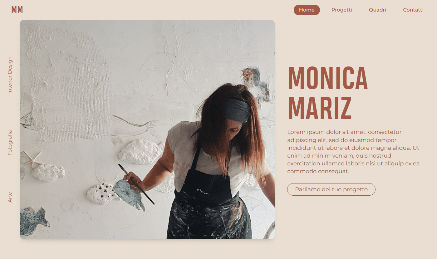
Monica Mariz
- Project type:
- Website
- Year:
- 2024
- Client:
- Monica Mariz
- Libraries:
- React
- NextJS
- Tailwind CSS
- Code:
- Git Hub
I created this portfolio website for Monica Matiz, an interior designer who wanted to strengthen her online presence beyond social media.
Monica needed a website that was simple yet visually captivating, able to clearly communicate her artistry and inspirations through her completed projects. It was essential for the site to be easily updatable so that new projects could be added effortlessly. For this reason, I implemented a system based on local markdown files, as I manage the content updates directly rather than Monica doing so herself. Mobile optimization was a top priority to ensure a smooth browsing experience across all devices.
I built the site using Next.js to ensure high performance, fast loading times, and solid SEO optimization. Publishing content directly on the website instead of using a CMS was chosen for cost efficiency and because Monica does not need to update the content independently.
The project consists of 6 main pages:
- Homepage: an immediate and elegant presentation.
- Projects Overview: offering a general view of her works.
- Individual Project Pages: providing detailed insights into each project.
- About Page: telling Monica’s story and her creative approach.
- Paintings Page: dedicated to a curated selection of her artistic works.
- Contact Page: enabling direct communication.
One of the most challenging and interesting technical aspects was developing the cascading grid with a masonry layout, which distributes images and text in alternating columns for a visually consistent result. I also implemented a category filtering system to make browsing projects more intuitive.
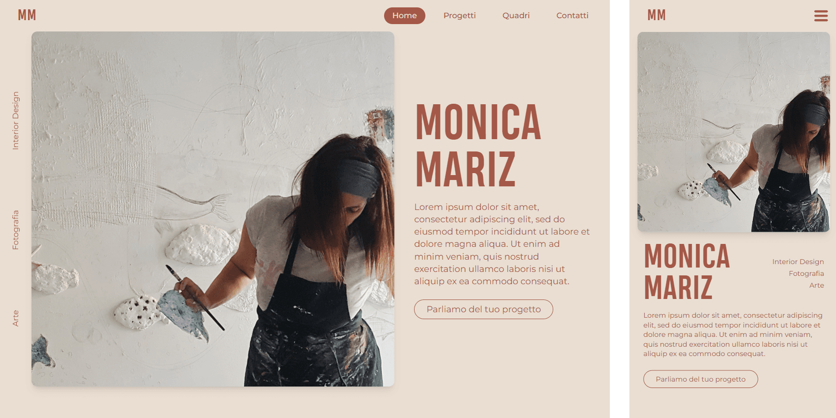
The homepage hero section features Monica as the main subject, with her name displayed prominently and a brief description introducing her identity and work. I included three key concepts that represent her: arranged horizontally for the desktop view and stacked vertically for mobile devices. The section is completed by a call-to-action button encouraging users to contact her directly via email.
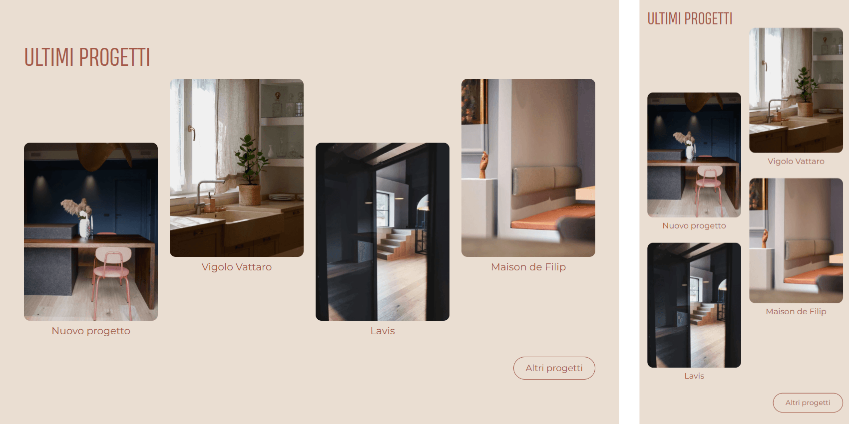
Directly below the hero section is a showcase of the four most recent projects, allowing quick and easy access. A button invites users to view the full project page for a complete overview.
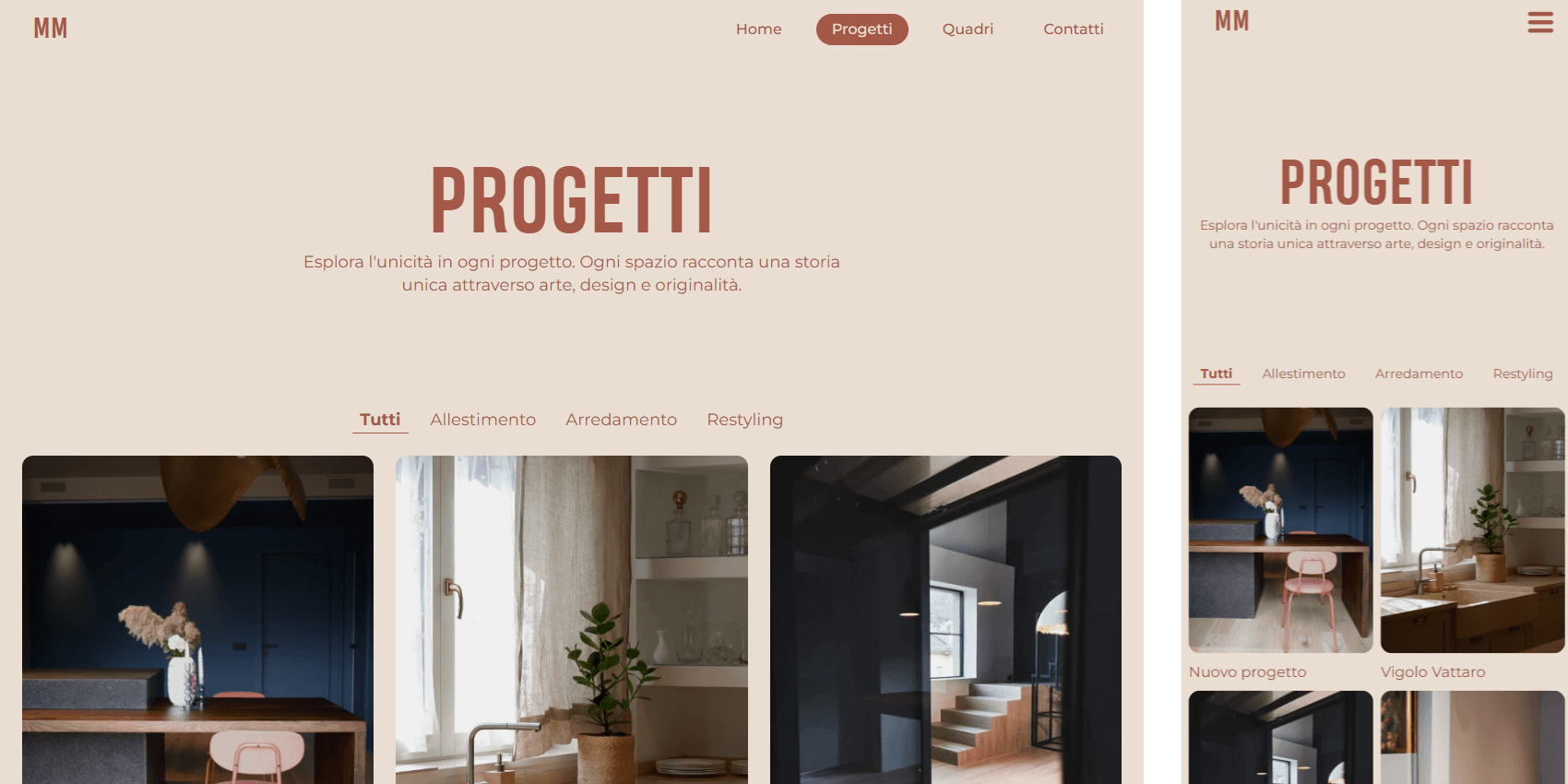
The Projects page opens with a large title and an impactful tagline. A filtering bar, which remains visible while scrolling, allows users to browse projects by category. Below this, a masonry grid presents Monica’s works.
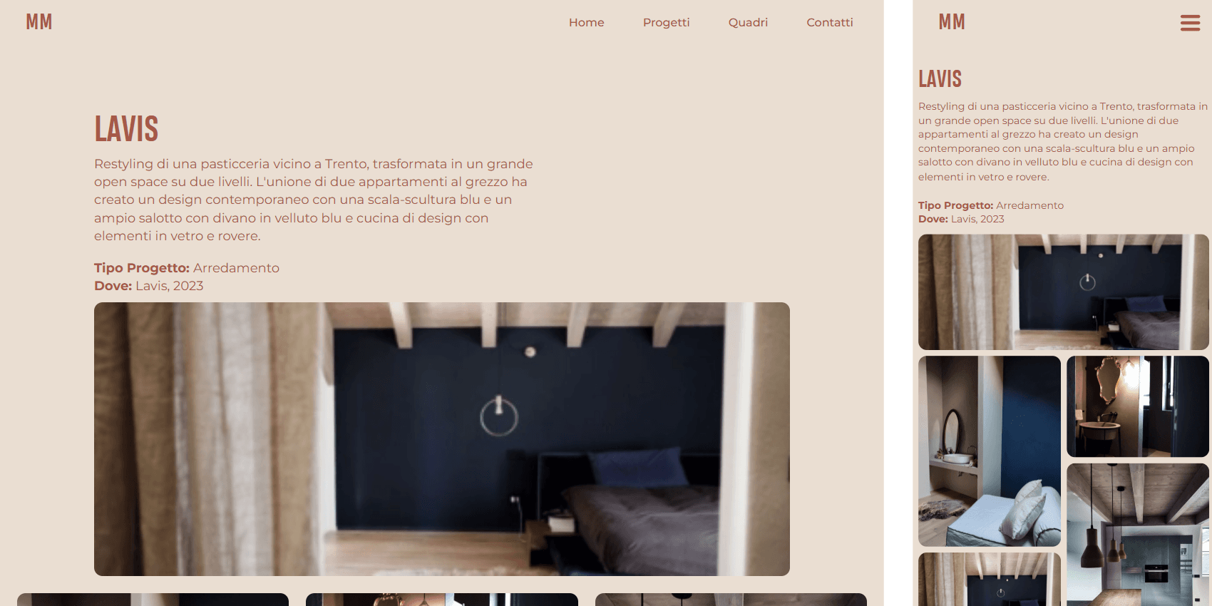
Each project page focuses on visuals, showcasing the environments Monica has designed. An introductory section provides a brief description with details on where and when the project was carried out. This is followed by a masonry grid of images.
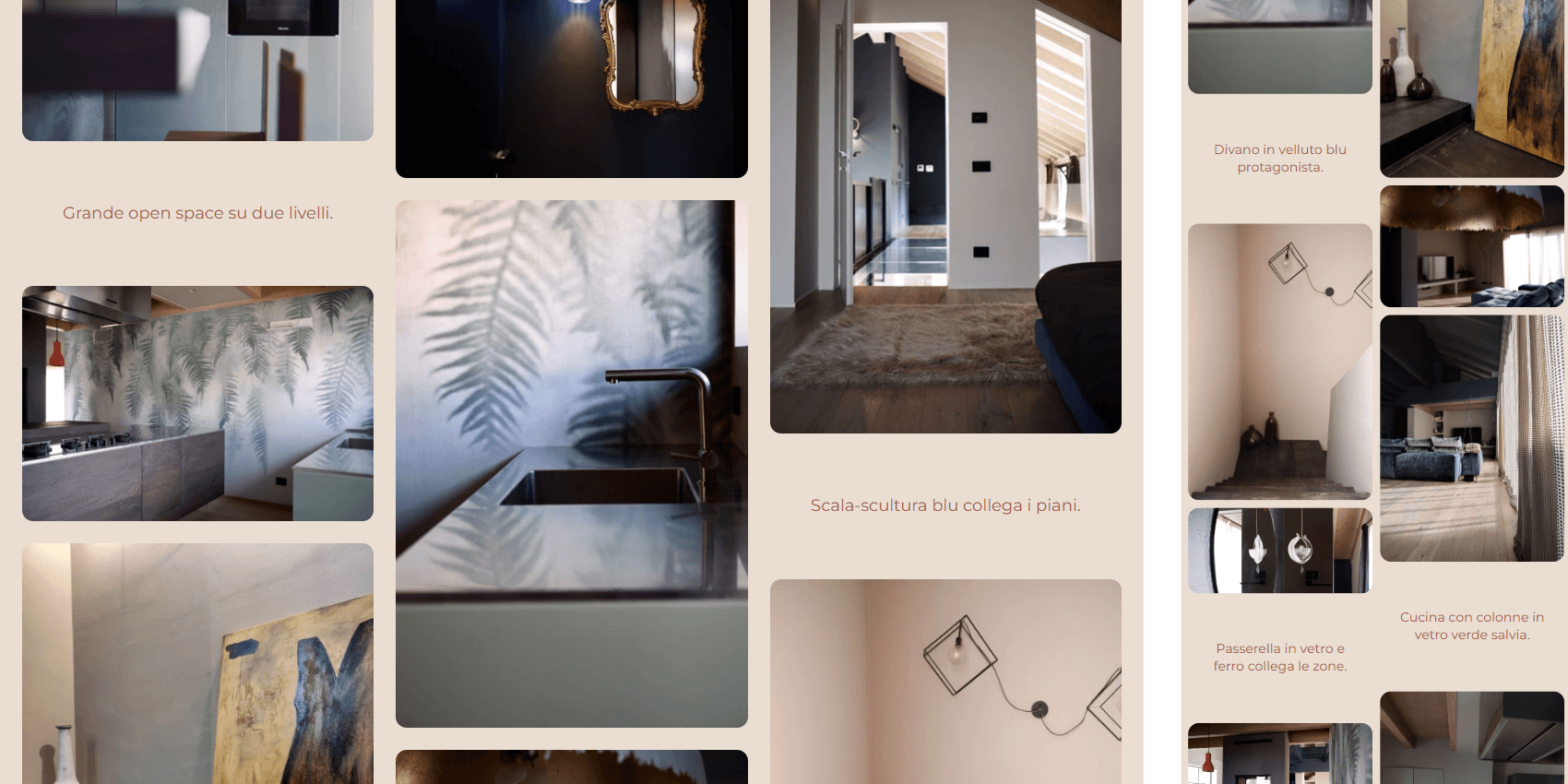
The image grid, inspired by Pinterest’s layout, alternates photographs with short captions that add extra information or highlight specific details about the project.
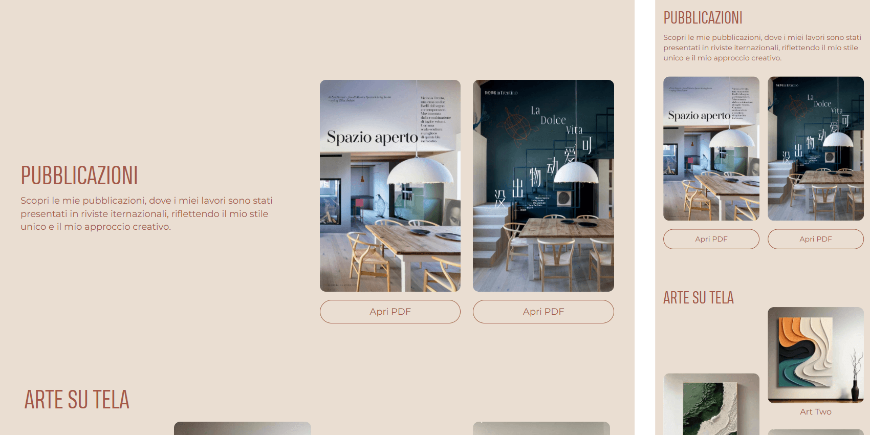
The homepage includes a section highlighting publications: articles and magazines that have featured Monica’s work. Each button allows users to download the full article as a PDF, viewable directly in the browser.
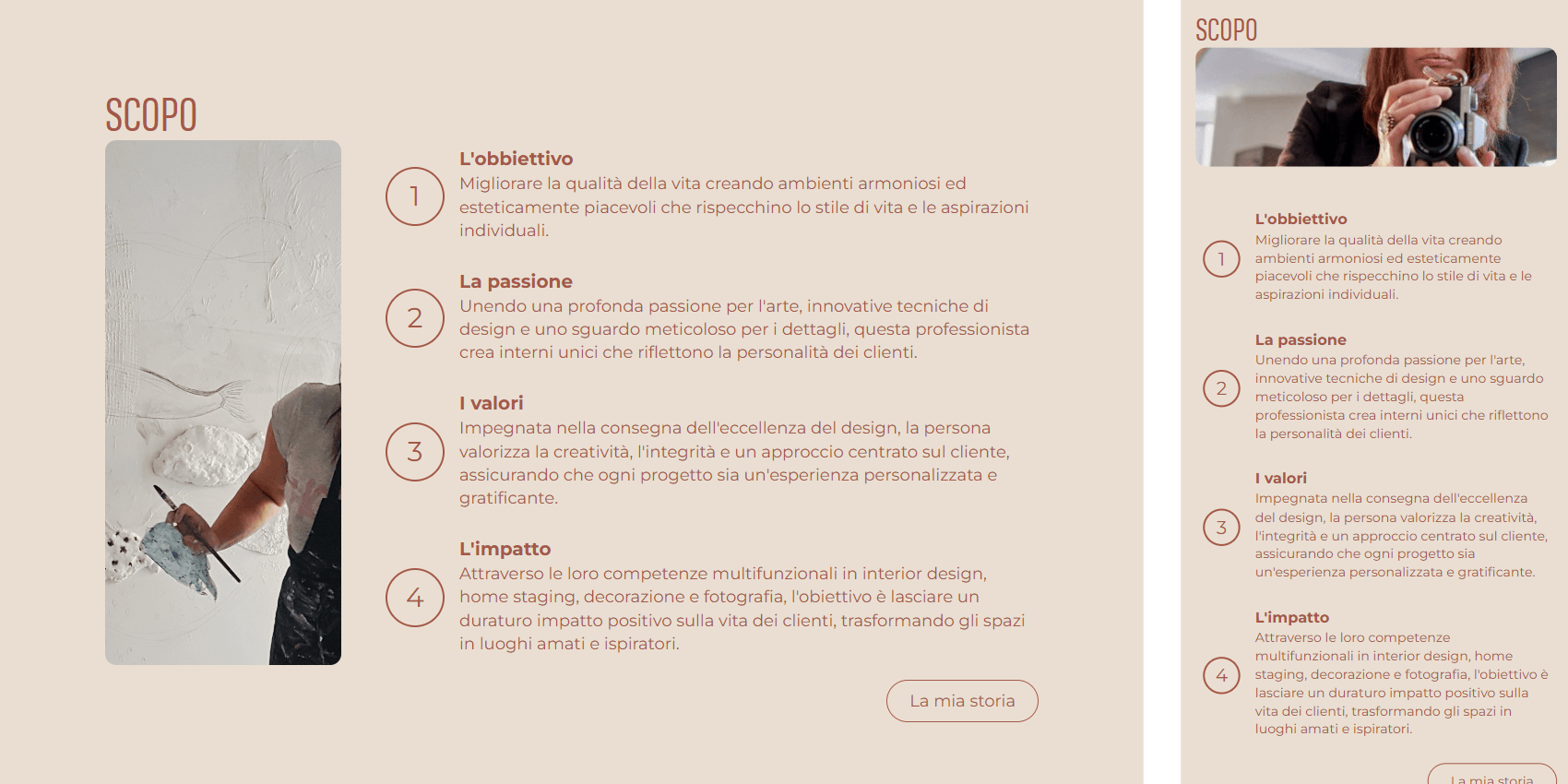
This section of the homepage explains what Monica aims to achieve through her projects and the impact she seeks to create for her clients.